Soft Pastels vs Bright Colors in Nursery Art: Creating the Perfect Baby Space
Share
Soft Pastels vs Bright Colors in Nursery Art: Creating the Perfect Baby Space
Choosing your baby's nursery colors is about more than just style—it sets the mood for your little one's first environment. Will soft, whispery pastels help your baby sleep better? Or will bold, bright hues spark joy and curiosity? Many parents wonder how color schemes in nursery art and decor can affect a baby's mood, sleep, and even development. The truth is, the colors you surround your baby with can gently influence their emotions and energy levels. In this article, we'll compare soft pastel colors and bright colors in nursery art, and explore how each palette impacts the atmosphere of your baby's room. By understanding the effects of each, you can create a nursery that’s not only beautiful but also tailored to your child’s needs.
Key Takeaways: Soft Pastels vs. Bright Colors
-
Mood Effect
Soft Pastel Colors: Calm, soothing, and relaxing for baby. Can help reduce overstimulation and promote sleep.
Bright Colors: Stimulating, energizing, and attention-grabbing. Can spark joy but may cause excitement or restlessness if overused. -
Aesthetic Vibe
Soft Pastel Colors: Gentle, dreamy, and airy. Creates a cozy, serene ambiance with a subtle, whimsical charm—ideal for peaceful themes (e.g. clouds, lullabies).
Bright Colors: Bold, lively, and playful. Fills the room with vibrancy and fun. Great for cheerful themes (e.g. circus, jungle) and adding personality. -
Best Uses
Soft Pastel Colors: Sleep & Calm Areas—Perfect for nurseries where you want tranquility (nap and bedtime). Newborns and easily stimulated babies benefit from pastels’ soothing presence.
Bright Colors: Play & Activity Areas—Excellent for play corners or day-use areas to engage developing eyes and minds. Wonderful as accent pieces to captivate baby’s attention and encourage play. -
Things to Consider
Soft Pastel Colors: Pastels are subtle; very young infants (under ~3 months) can’t see pale colors clearly at first. Balance pastels with some contrast (e.g. a darker trim or wall art outline) so baby can focus.
Bright Colors: Brights can be overwhelming in large amounts. Too much intense color (especially yellow or red) might overstimulate or agitate a baby. Use bold colors thoughtfully and pair with neutrals or pastels to avoid sensory overload.
Table of Contents
- The Psychology of Colors in Nurseries
- Soft Pastels: A Calm and Dreamy Atmosphere
- Bright Colors: Energizing and Playful
- Finding the Perfect Balance
- Conclusion
The Psychology of Colors in Nurseries
Color isn’t just a visual choice—it can influence how a baby feels. In fact, research in color psychology suggests that different hues can affect mood and even behavior from an early age. Babies don’t see the world the way adults do right away. For the first few weeks, newborns mainly perceive high-contrast blacks, whites, and grays. As their vision develops around 3 to 6 months, they become more attracted to brighter, primary colors because those stand out to their still-developing eyes. This means a vividly colored mobile or wall art might captivate a young infant more than something very pale.
Bright, contrasting colors provide important visual stimulation for babies, helping them learn to focus and distinguish shapes and patterns. That said, as babies grow a little older, they can also become overstimulated if their environment is too intense. Experts note that while bright colors and strong contrasts are great for development, an overload of vivid hues may overwhelm a child and make it harder for them to relax. For example, yellow is commonly associated with happiness and energy, but too much bright yellow in a room can actually lead to fussiness or stress for some babies. On the other hand, softer, muted tones (think gentle pastels or earth tones) tend to have a calming effect that can help soothe children when it's time to wind down.
In a nutshell, color impacts the nursery atmosphere: bold colors energize and grab attention, whereas subdued colors comfort and calm. Understanding this balance is key to designing a nursery that nurtures your baby's emotional well-being. In the following sections, we’ll look at how choosing a pastel scheme versus a bright scheme can shape a baby's environment—and how to strike the right mix of both.
Soft Pastels: A Calm and Dreamy Atmosphere
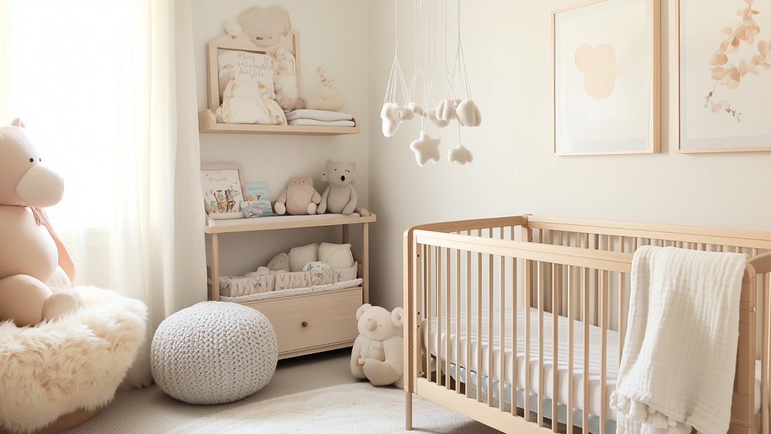
Soft pastel colors include gentle hues like baby blue, pale pink, mint green, lavender, and light yellow. These colors are low in saturation, meaning they aren't intense or glaring. Instead, they create a calm and dreamy atmosphere—think of a twilight sky or a watercolor painting. Pastels in a nursery can make the space feel cozy, safe, and soothing, which is wonderful for nap time and nighttime routines. Many parents love pastels because they promote relaxation; for instance, pastel purples (lavenders and lilacs) are noted to be especially serene and calming. Pink, another popular nursery pastel, is famously comforting for children and can even help reduce tantrums.
Babies who are easily overstimulated or have trouble settling down may thrive in a pastel-colored room. The muted tones are gentle on developing eyes and can help signal that the nursery is a place for rest. Pastels also carry a timeless, classic aesthetic. They pair well with sweet nursery themes like fairy tales, animals, or clouds. You can imagine soft pastel wall art of cuddly elephants or sleepy stars complementing a light-colored crib and curtains. For example, a set of pastel nursery art prints featuring cute characters or calming nature scenes can tie the room together and reinforce that peaceful vibe.
Pastel color schemes are especially useful around the crib or nursing area, where you want to encourage quiet and comfort. If you paint the walls a very light hue or use pastel wallpaper, consider adding a touch of contrast so your baby can still focus their eyes (such as white furniture against a pastel wall, or a soft mobile with hints of gray or beige). Overall, a pastel nursery envelops your baby in a soothing embrace of color. It’s an ideal choice if you value a tranquil environment or if your baby tends to be sensitive to lots of stimulation.
Tips for Embracing Pastels:
- Stick to a palette of 2-3 complementary pastel shades (e.g. mint green and pale yellow, or baby blue with soft gray) to create a unified, calm look.
- Incorporate textures and patterns for interest instead of additional colors. For instance, a white rug with a subtle pastel pattern, or curtains with light polka dots or stars, keep things visually engaging without loud colors.
- Use pastel-colored nursery art and accessories to reinforce your theme. Pastel prints, plush toys, and bedding can all coordinate for a cohesive design.
- Make sure to have some contrast in the room (like a dark carpet or a bold-colored toy or two) so your baby’s developing vision can find focus. Even in a pastel room, a black-and-white patterned item or a navy blue trim can provide that needed visual anchor.
Bright Colors: Energizing and Playful
Bright colors are the bold, vivid hues on the other end of the spectrum—think cherry red, sunshine yellow, electric blue, vibrant orange, and hot pink. In a nursery, bright colors instantly create a sense of energy and playfulness. Babies and toddlers are naturally drawn to bright and contrasting colors. These hues stand out and are easier for young eyes to see, especially in the early months. A splash of bright color in nursery art or decor can capture your little one’s attention and even stimulate their curiosity and brain development. For example, a bold rainbow print or a colorful ABC canvas on the wall becomes a fun focal point for a baby to gaze at during tummy time.
Bright colors tend to evoke happy, uplifting feelings. A colorful nursery can feel joyful and full of life, which is great for a space where your baby will play and learn. Imagine a room with a lively mix of reds, blues, and yellows—it can resemble a little playland designed to make your child smile! These hues can also help with visual and cognitive development; children often learn to sort things by color as one of their first cognitive skills, and a brightly colored environment gives them plenty to observe and differentiate. Introducing vibrant art pieces or toys can encourage your baby to interact with their surroundings (reaching for that bright red toy or giggling at the colorful characters on a wall poster).
However, too many intense colors all at once can be overpowering. While a bright palette is exciting, it's possible for a baby to become overstimulated or fussy if every corner of the room shouts with color. Pediatric experts advise moderation: for instance, incorporate pops of bold color rather than painting all four walls neon green. Also, certain very strong colors have specific effects—red can be energizing but also increase alertness (not ideal right before bed), and large swaths of vibrant yellow, as mentioned, might lead to frustration or crying. The key is balance (more on that soon).
One smart approach is to use brights strategically. You might paint one accent wall in a bold hue or use bright decals, while keeping the other walls neutral or pastel. Or, keep the big items (walls, furniture) in softer colors and let the bright colors shine through decor and artwork. If you love the look of a vibrant nursery, go for it! Just watch your baby’s cues: if they seem overly excited or have trouble sleeping in a super bright room, you might dial back the intensity near the crib.
Tips for Rocking Brights:
- Choose a color scheme or theme to guide you, so the bright colors feel intentional. For instance, a "rainbow" theme can incorporate many colors in a balanced way, or a "space" theme might use deep blues with pops of rocket-ship red and planet orange.
- Use bright colors in focused areas: a bookshelf filled with colorful books, a gallery of vibrant nursery art prints, or a toy corner with multi-colored storage bins.
- Pair brights with neutrals or pastels. For example, a bright turquoise wall balanced by a white crib and pale grey bedding.
- Consider the room’s purpose: you might keep the sleeping area more neutral/pastel and reserve the boldest colors for the play area or on items baby uses during active times.
Finding the Perfect Balance
The good news is you don’t have to choose strictly between all-pastel or all-bright. In fact, many modern nurseries blend the two to get the best of both worlds. A harmonious mix of soft and bold colors can create a visually stimulating yet soothing environment for your baby. The trick is in how you combine them. Here are some ideas for balancing pastels and brights in your nursery design:
- Accent with Brights in a Pastel Room: If you prefer a mostly calm, pastel nursery, try adding a few well-placed bright accents, like a colorful rainbow canvas or a vibrant patterned throw pillow.
- Soften a Bright Room with Neutrals and Pastels: If you adore bright colors, include elements that tone down the intensity, such as light-colored furniture and pastel accessories.
- Use Zones or Layers: Think about the nursery in zones—pastels near the crib for calm, brights in the play area for engagement.
- Colorful Artwork and Mobile: Hang a pastel-themed mobile over the crib and display bright picture books or prints on shelves elsewhere.
- Follow Your Baby’s Lead: Pay attention to your baby’s reactions. You can always start with mostly pastels and add more color as they become a curious crawler.
The goal of finding a balance is to create a harmonious nursery that adapts to different moments of the day. By mixing palettes, you ensure the nursery isn’t one-note. Don’t be afraid to experiment with a pastel wall mural and a brightly colored toy chest in the same room. Start with a neutral base (like white walls or light furniture) and layer in pastels and brights until it feels just right.
Conclusion
Designing your baby’s nursery is an exciting journey, and choosing the color scheme is a big part of it. Soft pastels and bright colors each offer unique benefits: pastels weave a gentle, calming spell ideal for rest and reassurance, while brights bring in fun, energy, and stimulation perfect for growth and play. There’s no strict rule saying you must pick one over the other. In fact, the best choice often comes down to your baby’s personality and your own sense of what atmosphere you want to create.
Some babies are naturally more tranquil and might appreciate a more vibrant environment to spark activity, whereas others are little firecrackers who calm down best surrounded by cool, soft tones. Remember, you can mix and match—start with a pastel nursery and add bright decorations as your child grows more curious. At the end of the day, the most important thing is that the nursery feels comfortable and loving for your baby (and for you). Trust your instincts and have fun with it. After all, creating a nursery is as much about celebrating your baby as it is about decorating a room.
As you plan your color palette, feel free to explore our offerings for inspiration. From the gentlest pastel nursery art prints to the most colorful, bright wall pieces, we have a range of options to help you bring your vision to life. Ultimately, whether you go for a dreamy pastel haven, a vibrant color wonderland, or a bit of both, your thoughtful effort will shine through. Your baby’s room will be a special place filled with warmth, joy, and personality—just like your little one.
Share
